The problem we were solving
AbbVie's Operations Launchpad is the central hub for reporting applications across the enterprise, but it lacked something critical: a unified way to monitor and act on changes in business-critical KPIs. Notifications were scattered across individual applications, inconsistent in timing and format, and impossible to manage from a single interface. Data analysts and operations leaders had no reliable way to stay informed of threshold violations or other critical events that demanded immediate attention.
This was the first time any centralized alert system was being built for Operations at AbbVie. The challenge was clear: create a notification framework that could integrate with dozens of existing reporting applications (built on different platforms — Qlik, Spotfire, PowerBI, custom web applications), standardize how alerts are triggered and delivered, and make it easy for users to stay on top of what matters most to their role.
Scope and execution: We delivered the alert system in two phases. Phase 1 established the core platform with custom application notifications on desktop and mobile. Phase 2 refined the user experience and scaled to onboard diverse application types(Qlik, PowerBI etc.) . By the end, multiple KPIs were live in production from different business verticals, each actively used by 5–6 business stakeholders.
Understanding the notification landscape
We started by studying how alert systems work across industries, examining frameworks used in fintech, healthcare, and infrastructure monitoring. The research revealed a clear pattern: the most effective systems balance real-time urgency with user control, allowing people to customize what they're notified about without creating notification fatigue.
Next, we conducted a systematic audit of the Ops Launchpad ecosystem. We mapped every application currently on the platform, identified how each one handled notifications (or didn't), and documented the pain points users experienced when trying to stay informed. We also interviewed functional leads and data analysts to understand which KPIs they cared most about and how they currently monitored them often through manual checks or email spreadsheets.
The findings shaped our initial design strategy: build a system flexible enough to integrate with diverse application architectures, provide clear visual and mobile alerts, and give users granular control over what notifications they receive and how.
Three core principles
Based on research and stakeholder feedback, we defined three design principles that would guide all decisions:
What changed, and why
Early feedback from the development team and functional leads revealed that our initial concepts were ambitious but not practical. Several assumptions needed revisiting, and the feedback pushed us toward a simpler, more deployable solution.
Piloting and scaling the platform
We structured the rollout into two distinct phases to manage scope and gather signal from real production usage.
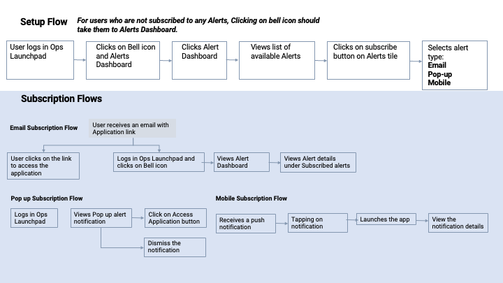
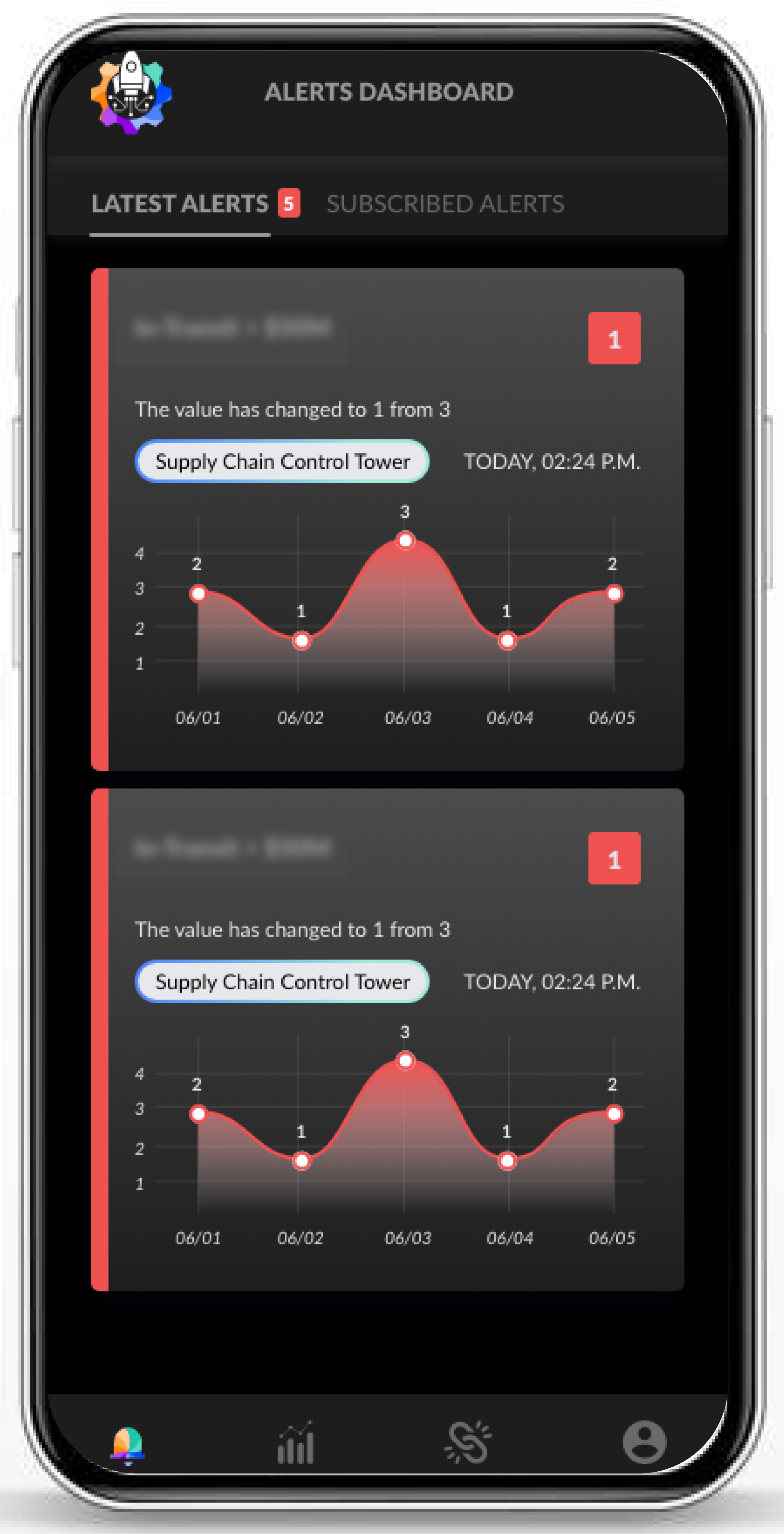
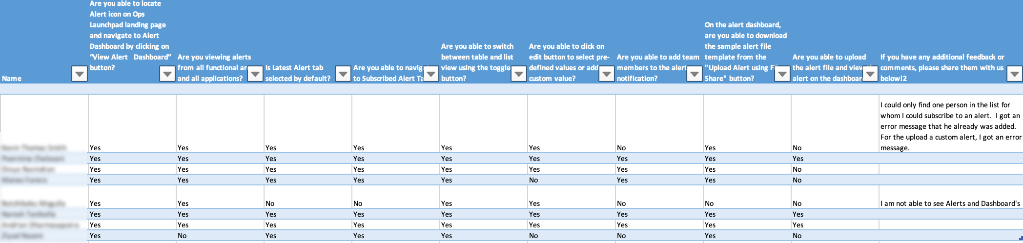
Phase 1 (Pilot): We launched with core functionality: users could subscribe and unsubscribe from KPI alerts, add new alerts through an Excel spreadsheet upload (low friction, high compatibility), and receive notifications on mobile. The UI was straightforward, though we knew from research it could be refined. Phase 1 was about establishing the technical foundation and validating that users would actually adopt centralized alerts.
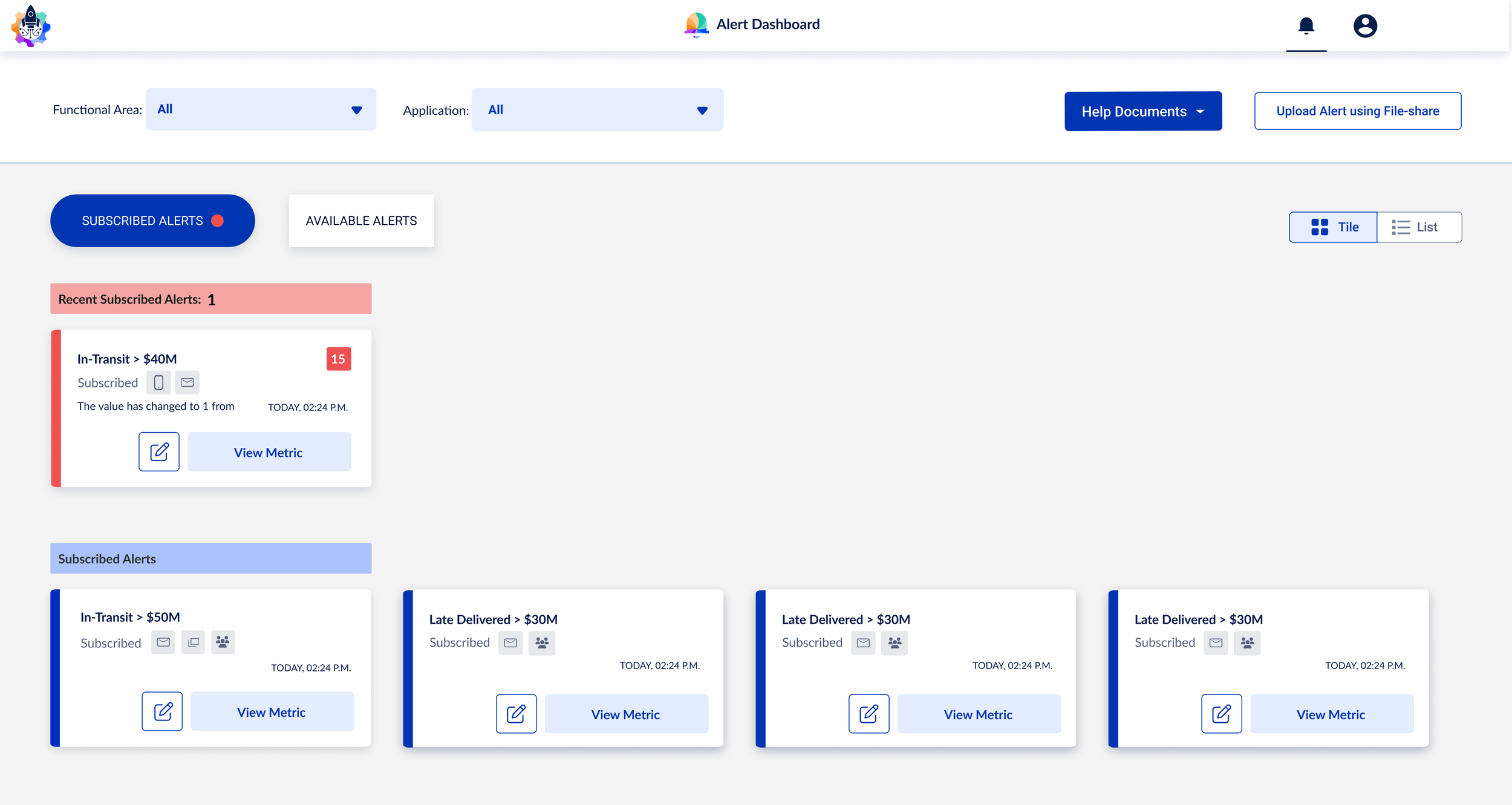
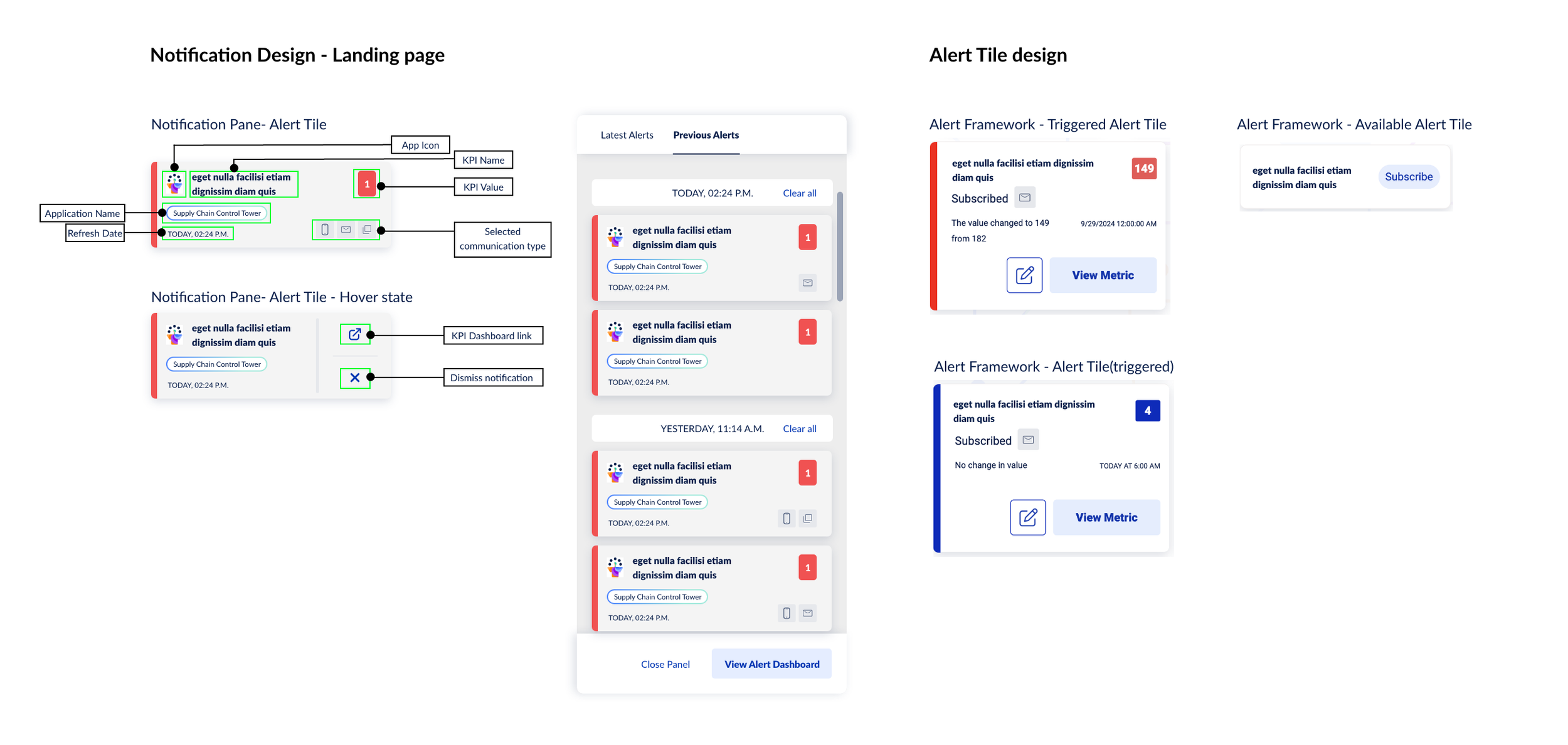
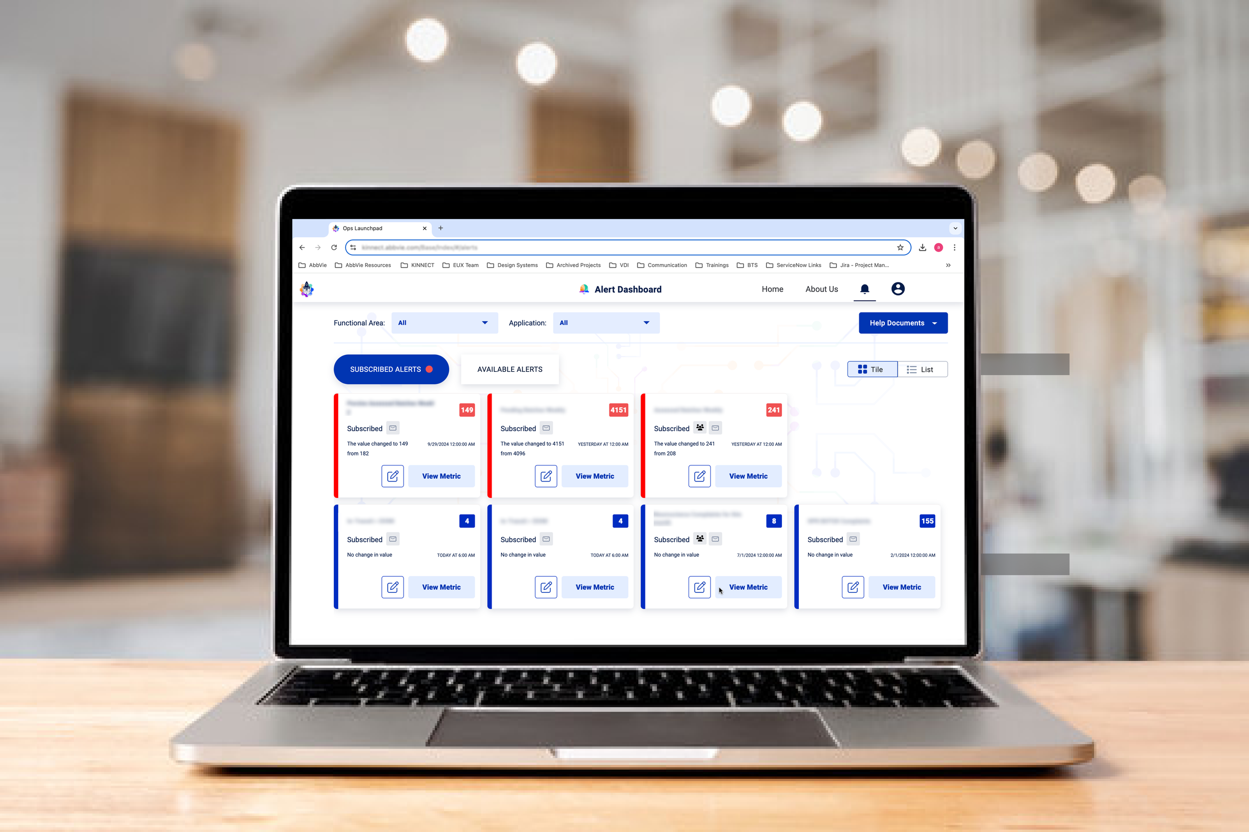
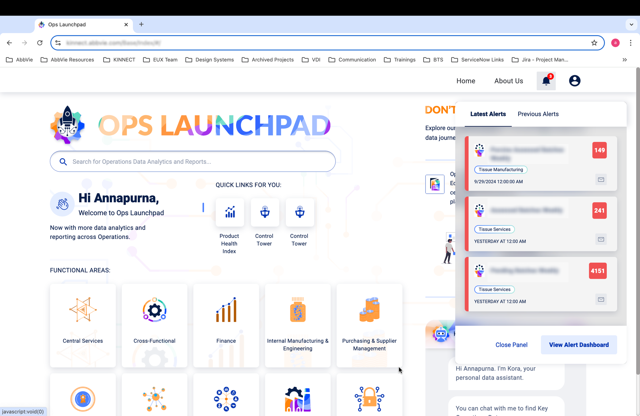
Phase 2 (Full Release): With pilot insights in hand, we redesigned the UI around a clearer mental model: Subscribed Alerts (what you're currently monitoring), Available Alerts (what you could subscribe to), and a Latest Alerts section with a red indicator for new activity. We also built a comprehensive user guide for onboarding KPIs from all supported application types, and we enabled advanced features like custom threshold values and user management per alert.
Why two phases worked: The pilot let us launch faster, gather real usage data, and refine decisions based on actual user behavior rather than stakeholder opinions. By Phase 2, we had concrete evidence of what users needed and why. This made conversations about trade-offs much clearer.
What the system delivered
The alert framework became an integral part of how AbbVie's Operations teams monitored the business. By the end of Phase 2, the system was supporting multiple live KPIs, each actively used by roughly 5–6 users — the adoption demonstrated demand.
Production Metrics
- 12 KPIs live and monitored
- ~60–72 total active users across all KPIs
- 100% uptime through both phases
- Mobile platform integral to engagement
User Experience Impact
- Replaced scattered, inconsistent notifications
- Reduced time to detect critical KPI violations
- Enabled users to customize their notification flow
- Simplified onboarding across diverse platforms
Organizational Value
- First centralized alert platform for Operations
- Foundation for future KPI monitoring expansion
- Standardized the KPI intake process across platforms
- Established a template for alert systems elsewhere
Lessons Embedded in Design
- Simple communication types over abstract hierarchies
- Mobile parity from the start, not as afterthought
- Pilot-and-refine approach to reduce risk
- Standardization solves real integration problems